Summary
This branch of design is specific to the the layout and development of publications such as journals, books, or newspapers. The could be cover art or interior graphics, with consideration of print guidelines. Designs in editorial media may not always be realistic, instead applying abstract concepts or relying more heavily on photography. Editorial design is really about storytelling and providing eye catching and informative visuals to compliment often large areas of text.
Journal Covers
These mockups of a journal cover and internal figures were designed for Nature and are based on the published neurology review Spinal cord stimulation for the treatment of chronic pain by Cecile C. de Vos and Kaare Meier. The review speaks to the varied success of spinal cord stimulation, the mechanism of action, controversies, and patient satisfaction. The editorial cover is meant to highlight the neurological component of chronic pain while emphasizing the placement of the device and leads. As the efficacy of the device varies, positive or negative connotations were avoided in the art, instead focusing on electricity and the nervous system. Two interior figures are also created, the first of which being a simplified diagram of how sensory pain travels through the spinal cord to the brain. The secondary figure is about the device itself and its use. Each illustration was designed and formatted to Nature’s style guide and requirements.

Published Covers
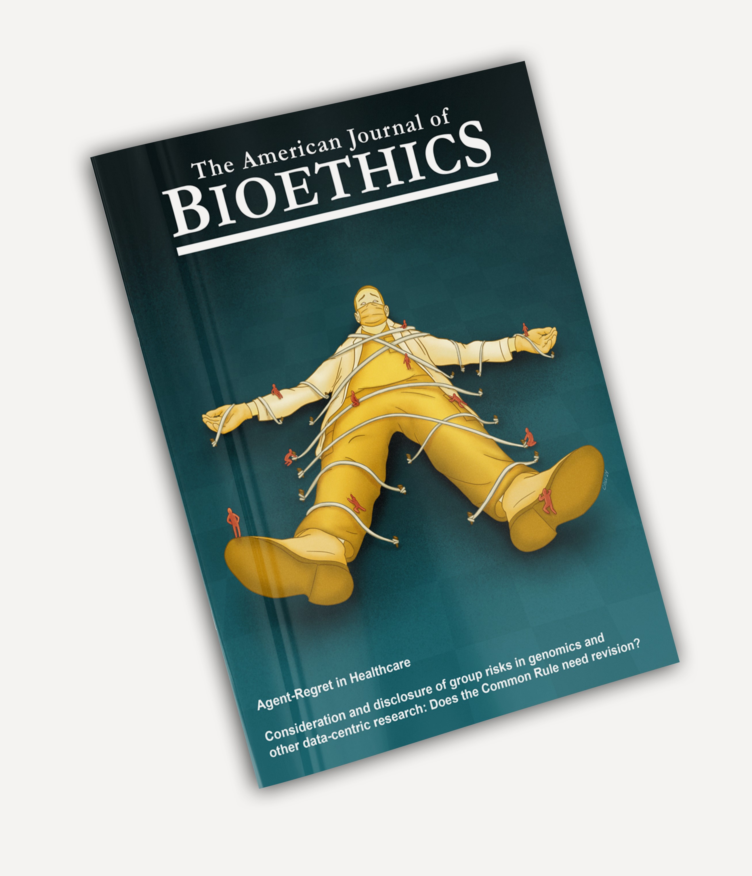
This editorial cover was published for The American Journal of Bioethics, Volume 25, Issue 2 (2025). The illustration is meant to be an abstract representation of agent-regret, which is a complex emotion felt by healthcare providers who made ethical decisions with negative outcomes.
To convey this concept, a feeling of inability to act was used. A healthcare provider in scrubs and a lab coat is tied down and physically restrained so that readers will feel a sense of claustrophobia that represents this paralysis. Though providers dealing with agent-regret can act through their choices, they may feel trapped and hopeless in their decisions. These decisions and outcomes are represented by small people climbing and restraining the provider. The dark teal background was selected to show oppression and negative emotions, whereas yellow was chosen as a complimentary color to distinguish the provider from the darkness. Inspiration for this design was taken from Gulliver’s Travels.
Handouts
The purpose of this pen and ink style illustration is to provide students learning the anatomy of the leg and foot better comprehension of the tarsal tunnel. There are six important structures that run through the tarsal tunnel and this piece was designed to isolate their path through it, as well as accentuate their spatial relations. The diagram on the right of the image has the six structures simplified to show the overlap of the tibialis posterior and flexor digitorum longus tendons. The order of the structures is meant to be compared to the detailed sides rendering of the pathways. With the labels centered and mirrored radiating leader lines, students should be able to compare and quickly identify the relationship of the tunnel contents. As this illustration is intended to be used in a textbook aimed at college students, it does not include a headline on the image itself. The page utilizes a three quarter image layout with a text area of relevant information.

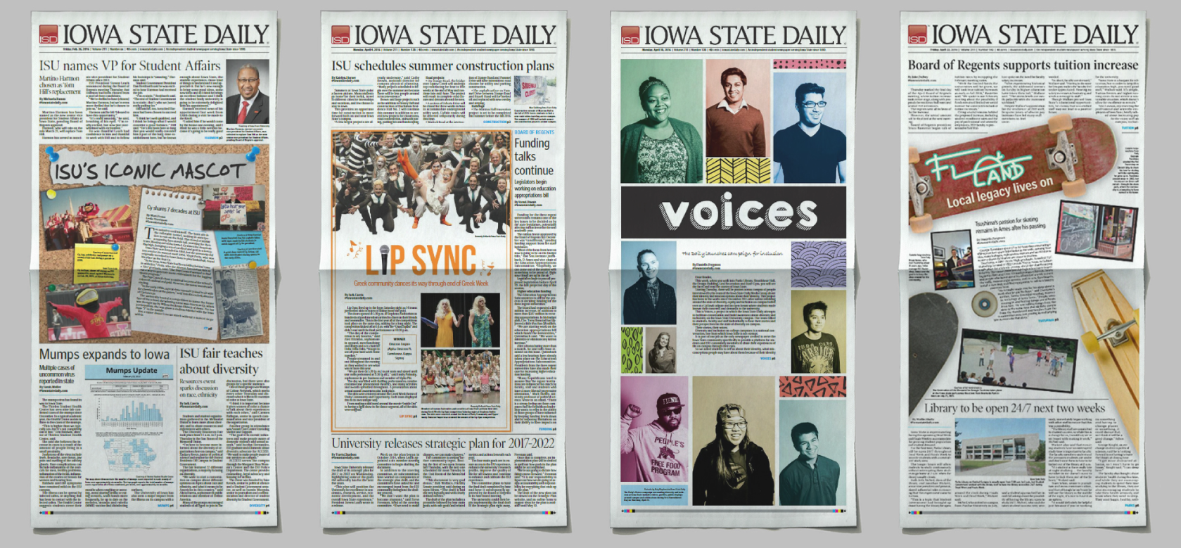
Newspaper Design
During my undergrad at Iowa State University, I was employed with the Iowa State Media Group, working under both their creative agency, Model Farm, and their news branch, the Iowa State Daily. While there I developed an understanding of editorial process, consideration of readership, and copywriting skills. The editorial staff would meet in the evening and we would determine which stories would run for the days paper, and as a team, create an 8 page newspaper that was due to the printer by midnight. This role had me creating front page layouts and following strict guidelines for interior layouts.
For my work at the Daily I was given the Silver Award in Advertising by American Advertising Awards Student Competition and the 2018 Best of the Midwest for Single Page Design award by Associated College Press, 2016.